

During lockdown, I channelled my empty mental space into a creative data visualisation project, transforming gender balance statistics from boardrooms into knitted works of art.
Inspired by Sue Montgomery’s knitting-as-protest, I began with the Fortune 500, representing each company’s CEO and board composition in stitches of red (women) and blue (men). The process revealed striking patterns, from the average 30% female board representation to the dominance of certain male first names among CEOs.
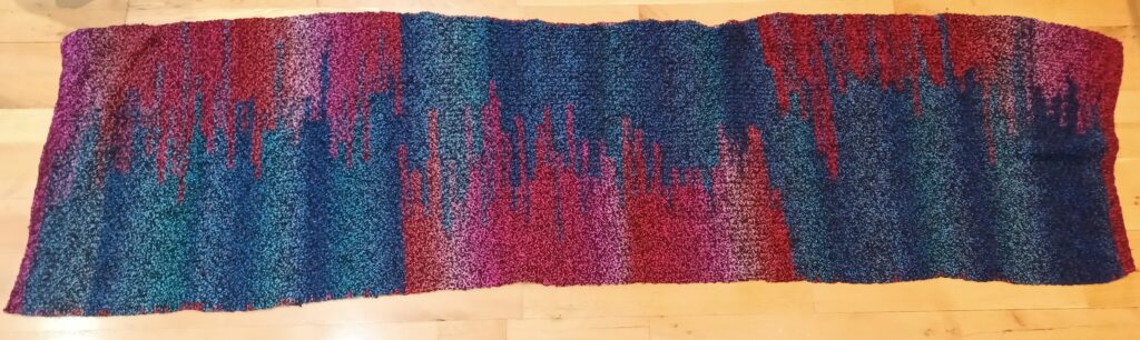
I expanded the concept to Ireland, comparing the gender balance across the top 85 boards in the Private, Public, and Charity sectors. Gathering the data was as revealing as the results, highlighting transparency gaps and sector differences—charities leading in female representation, private companies trailing behind.
The final knitted pieces sparked conversations about leadership diversity, showing how craft and creativity can make complex data tangible, engaging, and memorable.
Read more about this project here.